modevi
Chloe Health
& Aesthetics
Product design for an approachable skincare line boasting premium and high-quality products.
OVERVIEW
Modevi is an approachable, gender-neutral skincare brand offering high-quality products that are easy to incorporate into daily routines.
THE CHALLENGE
Striking a balance between youthful appeal and luxurious elegance, we can effectively capture the attention of the target market while conveying the premium quality of the product. A packaging that will stand out on the shelves and leave a lasting impression on consumers.
WHAT WE DID
clean & methodical
When preparing the various elements of the brand and packaging, we ensured that everything was clean and precise. We focused on a visual direction that embraces simplicity and minimalism without becoming boring. Given that it is a skincare line, we aimed to convey the scientific care that went into the formulation, and the packaging needed to reflect that. Our goal was to create a design that communicates both the meticulous attention to detail in the product development and the premium quality of the skincare products.
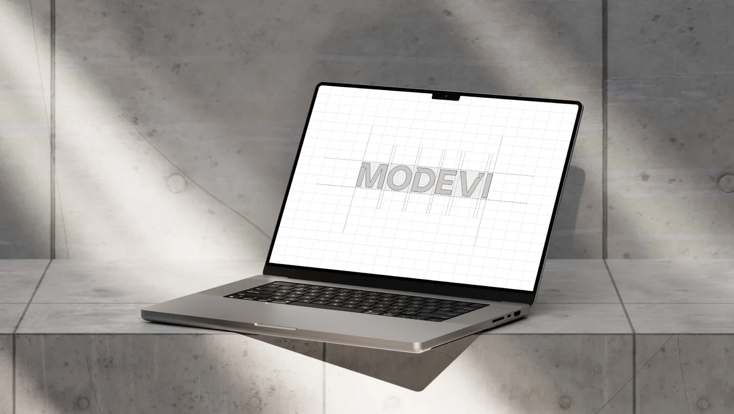
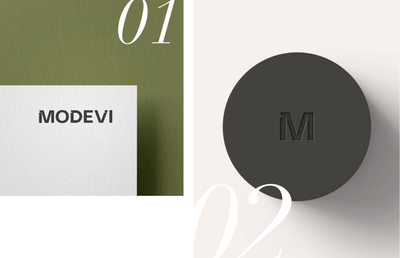
Narrowing down the brand name to a single letter while ensuring it remains distinctive involved careful consideration and strategic design choices. We focused on preserving its unique identity and making it easily recognizable, even in its simplified form.
STUDIES
FINAL LOGO DESIGN
The logo design was meticulously planned, with every aspect carefully measured, including the precise curvature of the lines.
product design
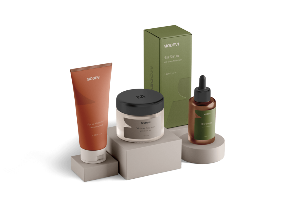
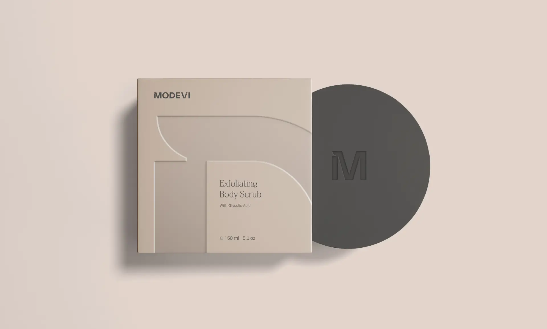
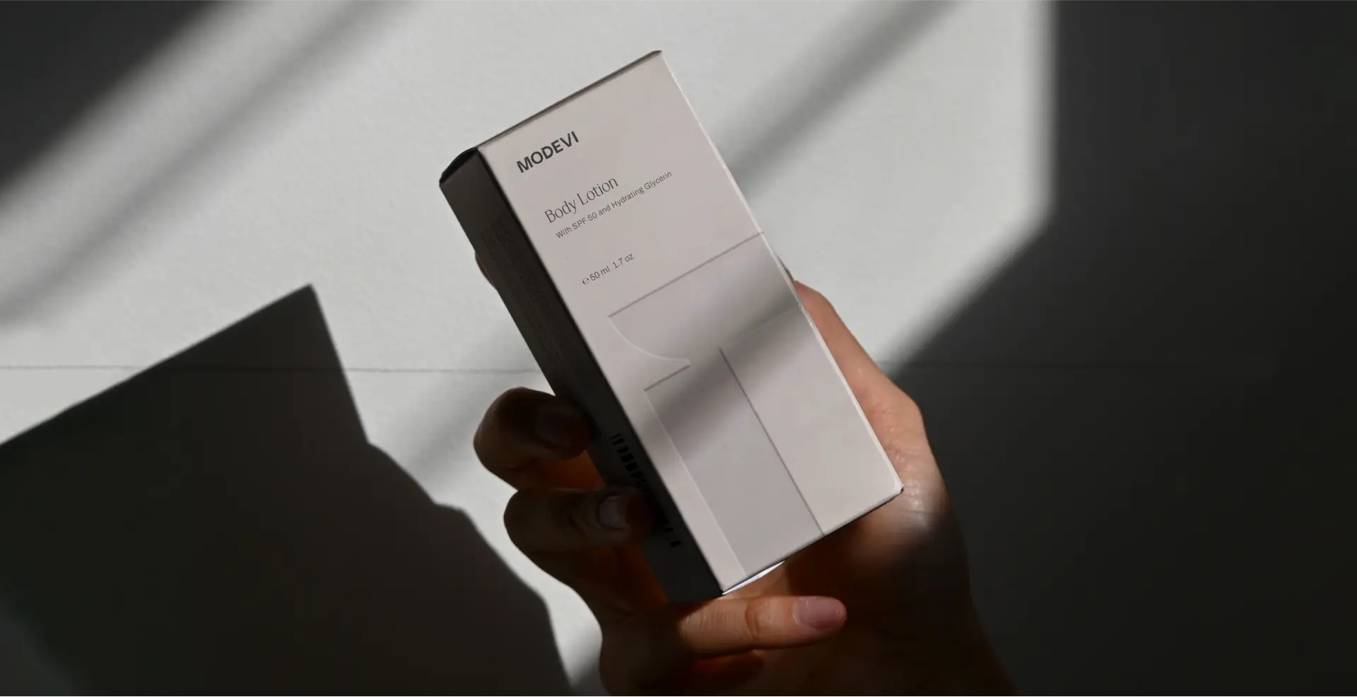
Taking into account the brand’s ethos, we focused on incorporating subtle design elements to ensure a serene and premium appearance. The use of warm and neutral colors enhances the welcoming feel, making the brand accessible and inviting. Additionally, the packaging features a subtle embossed graphic, adding a modern and unique touch that sets it apart. This design strategy effectively communicates the brand’s dedication to excellence and its sophisticated yet inviting nature.
versatility
Even if their product range encompasses various items, the quality and consistency extends across all lines. Our attention to detail and adherence to guidelines ensure that every product, whether it’s facial creams or shampoos, maintains the same high standards. Each item seamlessly integrates with the others, creating a cohesive and harmonious product offering that meets the diverse needs of our customers.
color palette & font
The products are categorized by color to indicate their specific use. Orange represents facial skincare products, including facial moisturizer, sunscreen, face serum, and toner. Beige is designated for body skincare items such as body lotion, body scrub, and hand cream. Lastly, green is used for hair care products, including shampoo, conditioner, and hair serum.
Three distinct fonts were utilized to present the product information, enhancing clarity and providing a cohesive visual identity.
heading
Quanta Grotesk Pro
Subheadings - Bold
Krylon
Body
Archivo
Orange
RGB: 195 99 65
CMYK: 19 71 81 6
Green
RGB: 109 115 63
CMYK: 56 40 87 21
Beige
RGB: 214 196 180
CMYK: 16 20 27 0
Black
RGB: 63 61 58
CMYK: 66 61 63 50
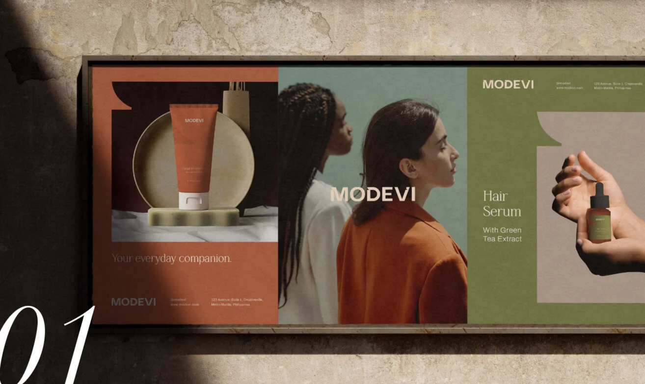
Moving beyond the skincare products, we ensured that the design elements could be effectively translated into various print materials. Key aspects were adapted to suit different print formats, allowing for consistent brand representation across all materials. These adaptations enable the design to be seamlessly applied to documents, posters, and other printed collateral, maintaining the brand’s aesthetic integrity and cohesive identity in every medium.
MERCHANDISING
Additionally, other merchandise samples were created to showcase the versatility of the brand and demonstrate how its identity can be extended beyond skincare products. These samples illustrate the potential for the brand’s design elements to be applied to a wide range of products, ensuring consistency and cohesion across various merchandise. This highlights the adaptability of the brand’s aesthetic, reinforcing its presence and appeal in diverse market segments while maintaining its core values and visual identity
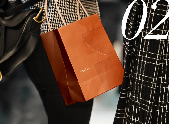
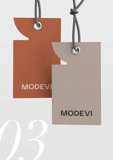
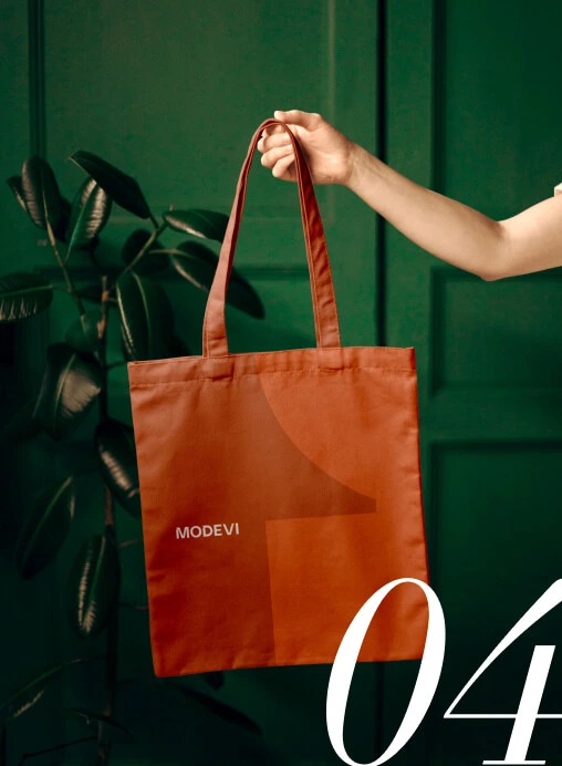
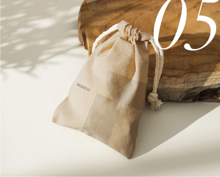
Examples include the canvas pouches and tote bags. These items are not only on-trend but also embody a simple yet elegant aesthetic when paired with the brand’s design elements
social media
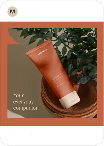
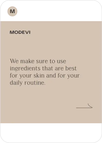
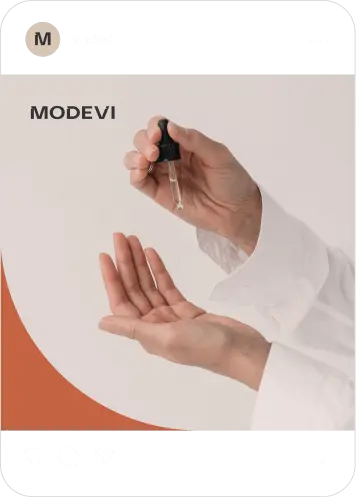
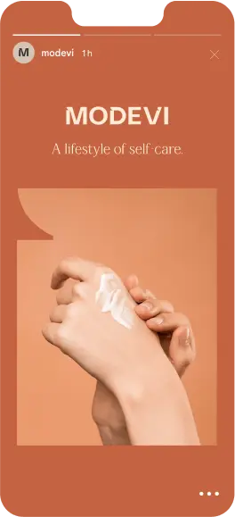
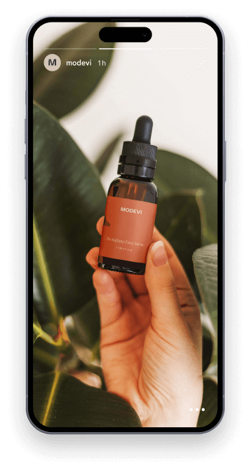
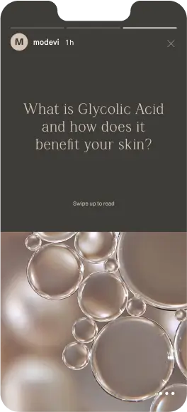
To establish the brand’s online presence, we formulated a comprehensive template and strategy for social media posts. This involved crafting a consistent visual style and messaging approach that aligns with the brand’s identity and values. Notable features of our strategy include warm backgrounds and carefully curated photos that highlight the unique features and benefits of our products.


gallery
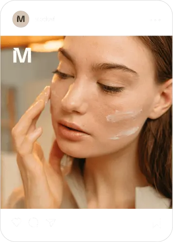
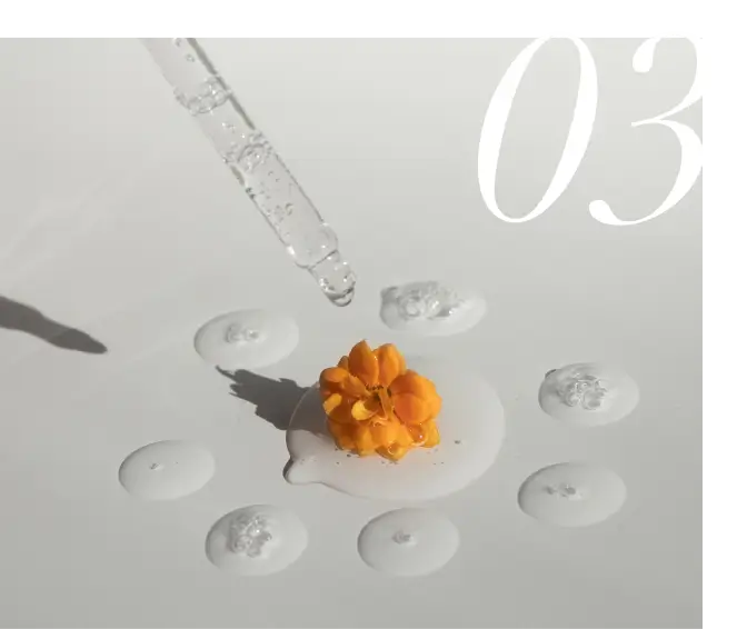
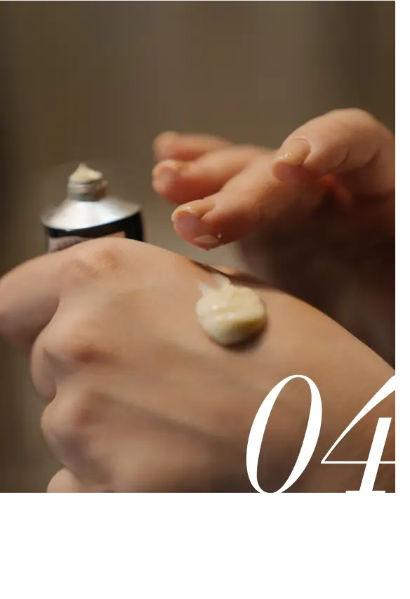
Lastly, we devised a strategy for incorporating real-life photographs into social media posts or websites. These guidelines serve as a framework to assist in selecting the appropriate types of images that align with the brand identity and messaging. By providing direction on the style, composition, and subject matter of the photos, we ensure consistency and cohesion across all visual content. This enhances the overall aesthetic and storytelling of our brand, helping to engage and resonate with our audience effectively.



Interested? Feel free to leave a message
Name, Company


